fbpx

Behind The Cover – Make Good Trouble with Karen Smith

Last night (March 7th) was the The Academy of British Cover Design awards where Repeater designer Hollie Smith was nominated for the non-fiction category for the cover of Collapse Feminism. In honour of the awards, I spoke to Karen Smith, Head of Book Design at Watkins Media about the decisions behind the cover of Make Good Trouble, written by Briana Pegado.

The process of designing a book cover has several stages. First, the editorial team put together a brief for the designers so they have a better understanding of how they want the book to come across. The design team are also shown examples of competitor titles so they can visualise how the book might look on the shelf of a bookshop next to titles in the same genre.

Make Good Trouble had a somewhat challenging brief.

It was the desire of the team that the cover of Make Good Trouble ought to encapsulate that energy of disruption written about in the book. It had to be dynamic, energetic and have a sense of movement to it. Make Good Trouble was not a book written to be pretty but to be powerful. This was taken into consideration.

The theme of  ‘good trouble’ can be conceptualised in many ways. For example, through the imagery of disturbances like cracks, broken screens, mirrors, rubble and fire. These speak to one half of the brief – trouble – but finding imagery to encapsulate positive disruption fit more closely to the contents of the book. Briana was presented with various designs at each stage of the process and talked through their merits with editor Ella Chappell. I asked Briana to speak to her experience of the process, as she was highly involved throughout:

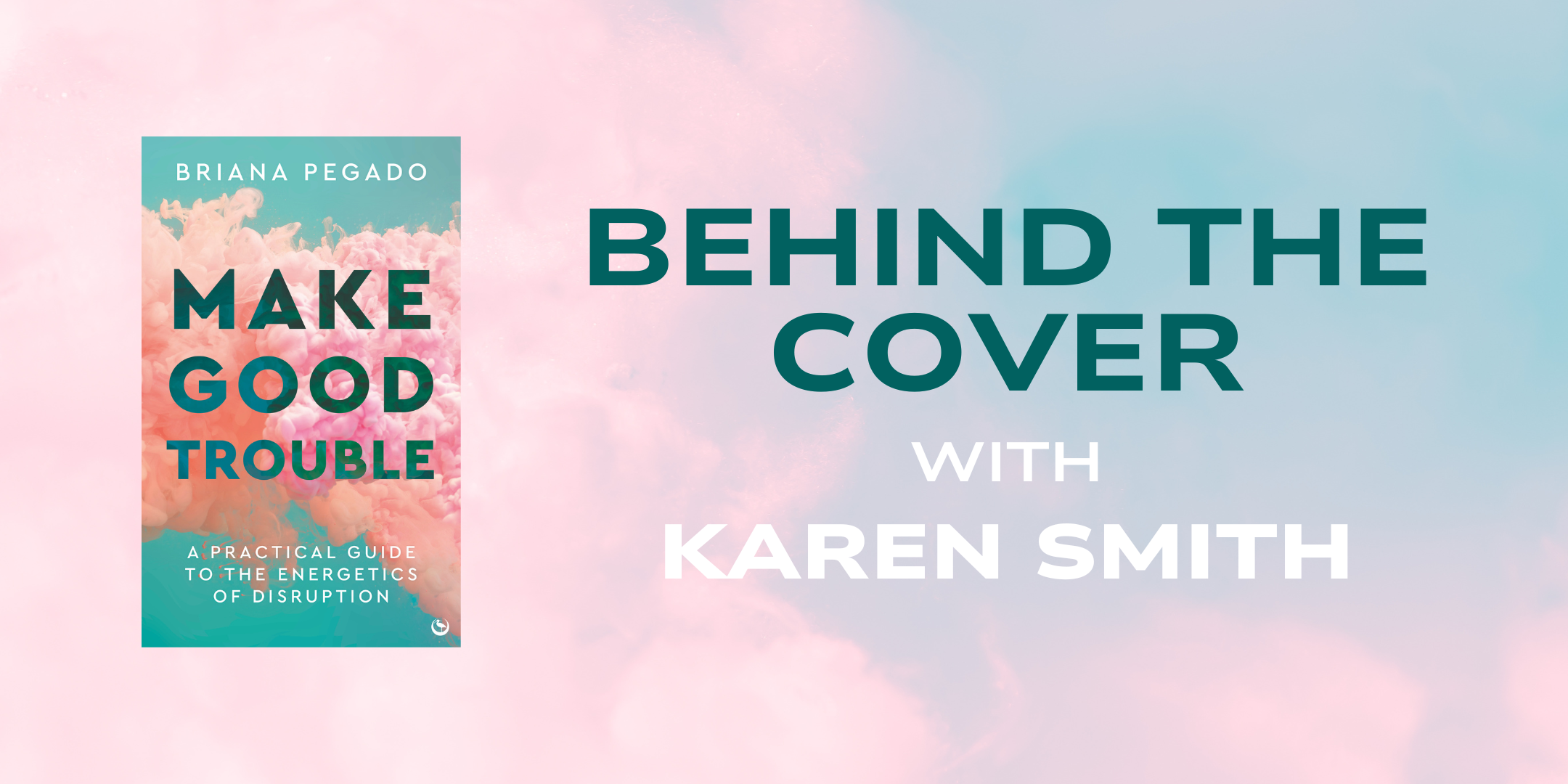
“The creation of a cover design is a process of exploration, tweaking and prototyping. I love collaborating with a designer to help them bring a vision to life. With the cover for MGT, my editor Ella Chappell initially sent me a few options for the cover. We discussed the merits of each of those options. The designer had clearly done a brilliant job of interpreting the idea of disruption in a visual way, from glitches and smoke emerging across the page, to fissures and cracks running through the typography. We discussed the merits of having a darker background versus a lighter one to allow the design effects to pop. Ultimately, I asked Ella what she thought the book’s target audience might respond to. She explained to me that the cover also goes through a development process internally, taking into consideration the feedback from sales, marketing, publicity and rights departments, who are able to share their expertise on the book’s target audience. In the end, the cover that was both mine and Ella’s favourite was also the favourite among the in-house team. We landed on the image of smoke gathering behind the title of the book. The colours are evocative, but soft, mirroring the message of the book – making good trouble.”

After much brainstorming, Karen and the team agreed upon the image of the conflicting clouds of smoke which you see on the cover today. This final version was presented to Briana and Ella for consideration and received author approval. It has movement, energy and a feeling of change – a sense of pushing against the grain without being aggressive or violent. These colourful puffs overwhelm the page without hanging heavy. They imply an immersion into Briana’s world of taking charge and changing for the better. The design is an appeal to action in a transgressive, non-violent yet urgent manner.

The colour scheme was intentionally chosen to reflect a sense of femininity, inspired by Briana’s writing on Goddess Energies. Many books about rebellion and trouble-making have a dark and heavy colour scheme that demands attention from the viewer. However, Briana Pegado’s message is not one of aggression but one of peaceful action and positive change. She connects to her readers on a deeply personal level, appealing to their sense of purpose, values and community.

There was an alternative colour option considered for what would become the final cover, consisting of teal and yellow. The final cover incorporates the Pantone Colour of the Year: Peach Fuzz. The muted pink, peach and blue tones allude to a gentle, uplifting tone whilst still conveying the contrast between pink and blue, representing the activist and the change.

Karen chose a strong, clear, bold typeface for the title MAKE GOOD TROUBLE. It is a darker tone of the pastel green background with transparency allowing the texture of the clouds behind to come through. It is a visual manifestation of how we can view the same world through a different lens, apply new thought to the same problems and create change without destruction. Black is nowhere to be seen on the cover of this inspiring book. There is only optimism and positivity exuding from the cover of Make Good Trouble.

Karen Smith and her designers have done a remarkable job of encapsulating the feeling of Briana Pegado’s text: embracing the energies of disruption in order to make good trouble.

The book Make Good Trouble by Briana Pegado is available to pre-order now. It publishes April 9th 2024.


A Peek into Publishing: Design with Kieryn Tyler

Welcome back to A Peek into Publishing! This is a new initiative we started last month where we reveal behind-the-scenes insights into working in publishing. So far, we’ve given you a peek into our sales and marketing departments. This week, we’re talking to Kieryn, who will be telling you all about design in publishing …

Kieryn Tyler, Designer

How did you get into the industry and into your current design role?

I studied graphic design at University of Norwich. In my second year, I was allowed to narrow down my discipline, so I graduated with a degree in Design in Publishing. After graduating, I applied to all the positions in book design I could find. However, a lot of feedback I received said I needed more experience, so I started doing freelance work, creating covers for commission. I’d been freelancing for six months when I applied for a job at Watkins. They had just acquired Angry Robot, their science-fiction imprint, and needed a new Junior Designer to keep up with the design work. 

In total it took me roughly two years after graduating before I secured a permanent position within a publishing company. I’ve now been working at Watkins for just over two years now (although it feels like less with half of that spent working from home) and have recently been promoted to my current role as Designer. 

What does your day to day look like as Designer?

My day varies depending on what I’m working on, whether it’s the Watkins, Nourish or Angry Robot titles, or helping with our Cygnus magazine. A few of my main responsibilities include managing the design of reprints (updating barcodes, making any design changes to new editions and updating the spine width if necessary), creating the marketing and publicity assets for advertising and designing the covers for upcoming Angry Robot titles. 

When designing a cover, I receive a brief from the editorial team and create a variety of options (between 4–8). After the author and editors narrow down which options they like, I’ll edit the chosen designs until we have one we like the most. The general rule amongst my team is that if you design the cover, you’ll also oversee creating the spine and back cover when the press deadline comes around. 

This week I’ve spent most of my time working on the Cygnus magazine, laying out the next edition. Next week I’ll be laying out a new book on mythology and tweaking some cover designs for an upcoming Angry Robot title. 

What were you most surprised to learn when you started in design in publishing?

I think I underestimated how much time I would dedicate to things that weren’t directly design related. When I first started as Junior Designer, I didn’t have a clear idea of what the role involved beyond creating covers and laying books out. I’d envisioned days spent on InDesign. In reality, there are a lot of other aspects involved in the making of a book cover: managing my time and different deadlines, attending meetings and liaising with other departments (such as editorial and production). 

I was also surprised how far in advance we design the cover. I’ll finalise the design, then not hear about it for a few months before I’m asked to create the back cover and spine. 

What is the best thing about your job? 

The best thing is designing a cover – it’s why I picked the job. I enjoy the research beforehand for a style and theme, then figuring out the puzzle of how it all fits together. The fun is in playing around with the design and finding a balance between what you want to design as the designer and what the market, author, agent and senior team say they want. 

What is the most challenging part of your role?

It’s challenging when a design idea you’re really attached to gets shot down. It’s part of the job and it’s never personal – the design has to fit a certain market, which means there has to be compromise. There have been some covers I really loved that haven’t made it to the final stage. But every idea is useful and when a design doesn’t work for one book, it might work for another, so it’s always a good idea to remember the designs and ideas for later. It all works out in the end – everyone just wants the book to succeed.

What would be your top tip for people applying to work in publishing? 

Keep designing!

When I finished university, I came away with a portfolio of my best designs from both the course and my work experiences. But then I had a two-year gap between graduating and getting my job at Watkins. It was important for me to show what work I did in those two years – to show initiative and willingness. 

One of the hiring managers from my Watkins interview said it was my enthusiasm that got me the job. There’s nothing more important than a general love for what you do. 

What’s one Watkins book you’d encourage everyone to read?

One we’ve recently published that I love is Anaïs Alexandre’s Potions, Elixirs & Brews. Some great cocktails and a lovely design!

Tell us about a project you’ve recently worked on?

I recently did the cover for a reuse project (an old book that we are republishing and rebranding). The Self-Sufficiency Bible by Simon Dawson is being republished after 11 years and we wanted a more modern, brighter cover that was suited to the target audience. I still had to use the old images from the book, but it was fun to find a way to make them fit this new brief. The book published in February and it was great to see the cover in person and add it to my Watkins shelf. 


That’s all for this week! We hope you gained a little more insight into what it’s like to work in design in publishing. We wish those of you seeking a job in design the best of luck! If you want to learn more about upcoming A Peek Into Publishing projects, follow Watkins on Twitter.

You can also follow Kieryn on Instagram!

Shopping cart0
There are no products in the cart!
Continue shopping

Home